 Times have changed in the world of UX since I first started in this industry. I designed and developed websites for only desktop views, and there was a standard content container size at that time. As a result, designing was much easier. If I placed a button on the screen it would stay that way on all devices, I didn’t have to worry about it moving. The only time I had to account for multiple scenarios was when it depended on the user’s internet browser. This all changed when Apple released the iPhone. We were all forced to break out of our rigid thinking in regards to designing and developing web pages. Now we had to design pages in a way that could respond, transform and adapt, seamlessly to any device. The terms responsive and adaptive design have been around for years, but what does responsive and adaptive design mean?
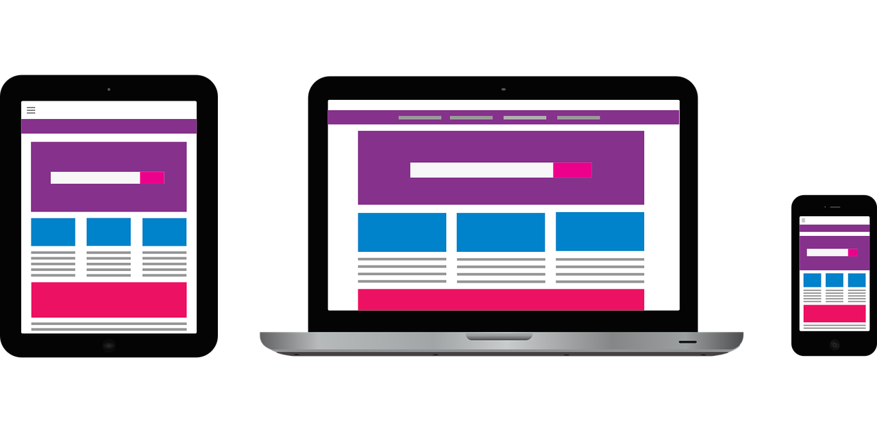
Responsive Design is when you design the experience to adjust according to the device (screen size, platform, and orientation) being used. This is done through using fluid layouts, media queries, and scripts. There is one flexible layout created that is able to detect the visitor's screen size and orientation and change the layout accordingly.
Adaptive Design is different from responsive design in that there isn’t one layout that always changes. Instead, there are several different layouts that are developed for multiple screen sizes (or viewports).
Knowing exactly how to approach the subject of designing for a digital experience to be responsive and knowing how it works from a development perspective is key. It allows you to see what is needed to create a design that responds correctly. It also helps one understand what needs to be communicated to the development Team and stakeholders in terms of ideas and designs.
When the internet was born, websites were mainly informative and were mostly developed as one clear, giant table of information. These tables included rows and columns, and the intersection of these are called cells. These cells were populated with information, like text, buttons, and images. Before CSS, tables placed content in the appropriate locations and kept the visual grid structure that is used to this day. Prior to the need to create responsive and adaptive designs, it was all pretty simple and rudimentary.
When designing a responsive experience, one needs to think of it as a table that has the width of the device’s viewport i.e. the screen size of the specific device. This table contains rows and columns. When you shrink the viewport (or browser) the table will adjust accordingly. The number of columns will not change, but instead, they will only become smaller. To prevent the columns (containing content) becoming a usability and accessibility problem when the width of the viewport shrinks, one will need to decide the width and how the columns will stack inside the specific row. This is what responsive and adaptive designs are all about.
In most cases, UX’ers are designing responsive layouts around 12 column grids (for smaller Devices, like the iPhone) they may drop the number down to 8. If your design calls for two content areas side-by-side in a container, they will need to be 6 columns (12 / 2 = 6). If you need 3 then each content area will be 4 columns. You can also mix and match content widths as needed, as long as the columns add up to twelve.
Breakpoints are where you set the width to stack the columns. The platform Bootstrap uses three breakpoints (sm (768px), medium (992px), and large (1200)). Keeping the number of breakpoints to a minimum helps make the experience simple and consistent when creating a responsive or adaptive design. It keeps the process simple and easy to understand, which in turn prevents your development team from running out of the building screaming.Always keep in mind that the idea around responsive and adaptive design is to create, design and develop one consistent experience regardless of the device. Think of the design and development process merely as setting rules to help that experience. This is not restricted to the horizontal collapsing of the experience, or the stacking of columns inside of a specific row. One can still include important functionalities like showing or hiding elements, adjusting the dimensions of elements and content for better usability, etc.
For more information on how responsive design works or how to design for responsive web, I strongly recommend learning more about the platforms Bootstrap and Foundation. You can also take our quick quiz on Which One Should You Use, Adaptive or Responsive Design?. Learning how responsive design works will help you make better decisions around the experience you are creating, and it will help you communicate your ideas to the developing team.
READ MORE: Flat Design UX Expert Review, Outstanding UX Research Naturally Leads Us to UX Design, Tamagotchi Gestures and UX Design, Four Key UX Best Practices for Chatbots, How to Create Trust Through Digital Design


Comments
Add Comment